Dropping one word: how we repositioned Valt for what comes next
A color company from the Valtellina, born in 1975, carrying a name that pointed backward. Repositioning it meant reaching from the org chart to the paint bucket, with one rule: shed a single word, keep everything else.
7 min read
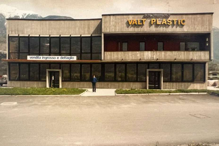
Valt was founded in 1975 in the heart of the Valtellina, a small local color shop that grew, decade by decade, into a company supplying paints and coatings to the professional construction trade. For most of that half century it went by a longer name: Valt Plastic. The word made sense once. The company's roots were in plastic wall coatings, and back then "Plastic" signaled exactly what it sold.
By the time we started working together, that same word had quietly turned into a liability. Construction is moving toward lower environmental impact, tighter specifications, and clients who read a label before they trust it. In that market, a name built around "Plastic" points a customer in precisely the wrong direction. So the project didn't begin with a logo. It began with a word that had to go.
A repositioning is not a new logo
The brief we set with Valt was never "make us look modern." It was to move the company from a local color shop into a business that can win and run bigger, more complex projects, without losing the fifty years of trade credibility that got it here. Its customers are craftsmen, builders, contractors, and designers. They don't buy on a mood board. They buy on reliability, and reliability is earned slowly.
That ruled out the obvious move, the clean-slate rebrand that erases the past to look new. What Valt needed was the opposite: a soft rebrand that sharpens what's already there instead of throwing it out. Decide what to keep. Decide what to shed. For Valt, the shed list came down to a single word.
The one word we removed
Dropping "Plastic" did more than tidy the name. It closed the distance between what Valt is today and what it used to be. The company had already grown well past plastic coatings into thermal systems, decorative finishes, mortars, and anticorrosive solutions, and it had already started taking sustainability seriously. The name was the last thing still describing the old company. Cutting it back to just Valt let the brand say, in one move, that its center of gravity had shifted, without pretending the first fifty years never happened.
Claiming the most famous blue in art
Here's the decision the whole identity turns on. For its signature color, Valt took International Klein Blue, the deep, saturated blue that Yves Klein developed in the 1950s and treated as a pure, almost immaterial thing in itself.
Think about what that means for a paint company. Klein spent his career insisting that a single color could carry depth, energy, and meaning on its own. Valt's entire expertise is color, mixed, matched, and specified for a living. Adopting the most famous blue in modern art isn't decoration. It's a claim: nobody understands color better than the people who work in it every day.
First there is nothing, then a deep nothing, then a blue depth. — Yves Klein
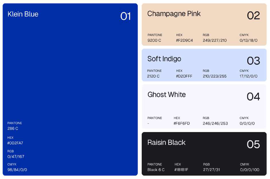
A company that had spent fifty years being modest about its craft now had a way to say, without a word of copy, that the craft is the point.
A logo that leans up
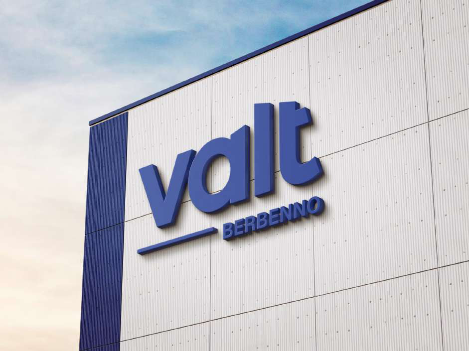
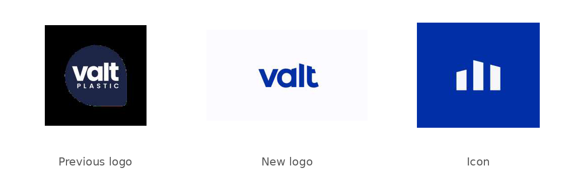
The old logo had a practical problem before it had an aesthetic one: it was hard to read and hard to use, especially on screens, where more and more of the brand now lives. The redesign kept the link to the old mark but rebuilt it around oblique and vertical geometry, shapes that read as upward movement and forward motion. The result is minimal and linear, and it scales down cleanly. From the wordmark we pulled a separate icon, a small pictogram built from the same angled forms, so the brand still holds together at the size of a favicon or a stitched logo on a work shirt.
Form needs something to sit on
None of this would matter if the new face sat on top of the old company unchanged. The most common way an industrial rebrand fails is by stopping at the logo. So the larger part of this project was the part nobody sees on a business card.
We rebuilt the governance first: a clearer org chart with defined roles and responsibilities, formalized operating procedures, and new hires brought in to run the strategic accounts that matter most. On top of that we put the compliance structure a company this size needs to be taken seriously by larger clients, a Modello 231 risk-and-controls framework, an updated code of ethics, and a whistleblowing channel.
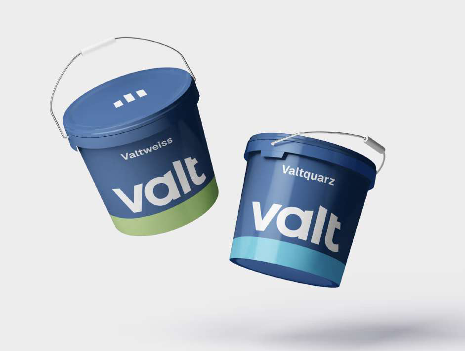
Then the product architecture. Valt's four existing systems were scattered and hard to read as a range, so we consolidated them into a clean set of named lines, Valtherm for thermal insulation, Valtexture for decorative finishes, and the rest, each with its own logic and its own place in the catalog. The same discipline carried through to the physical product, where every bucket, bag, and can now reads as part of one family.
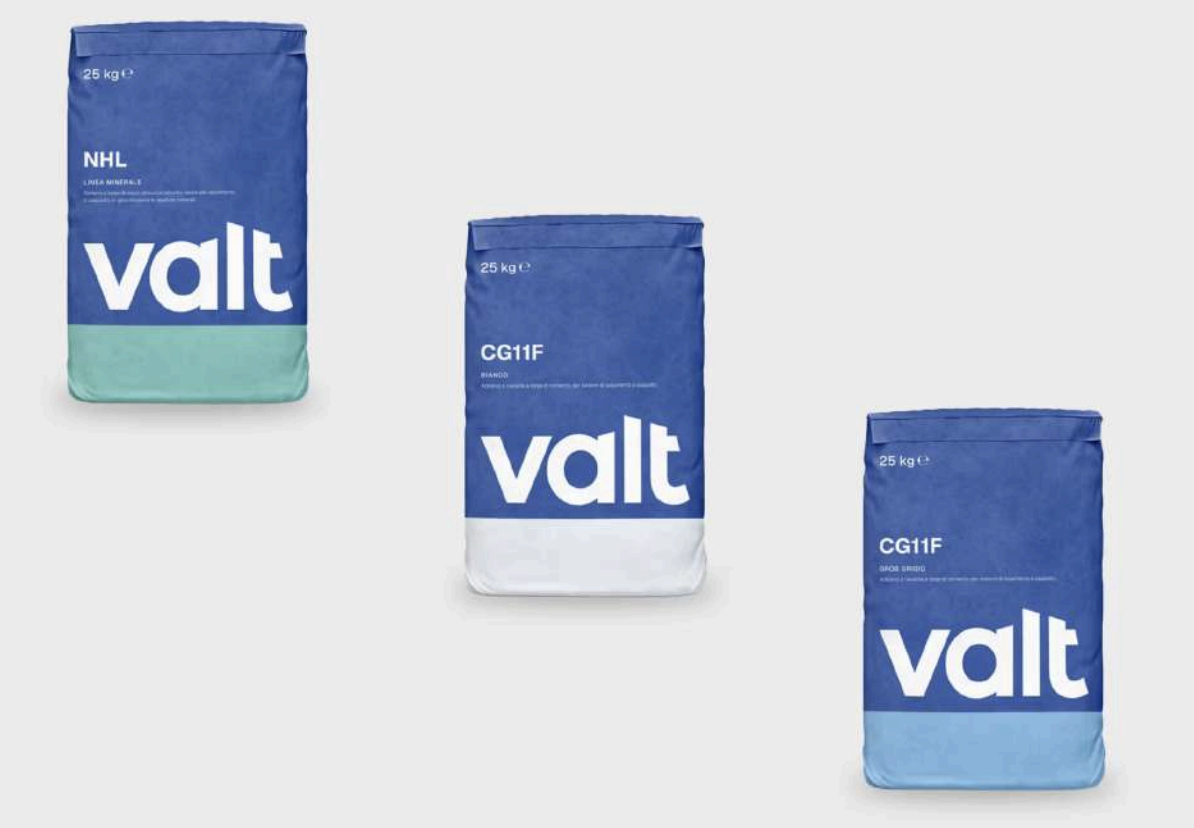
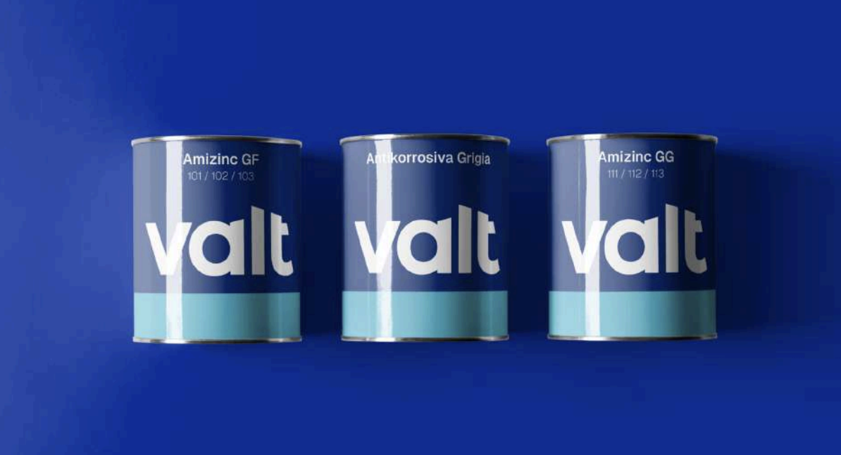
That work fed directly into a new website, built on WordPress and WooCommerce so every product could carry the granular technical detail a spec-driven buyer expects: downloadable, always-current data sheets, clear certifications, related products, split cleanly between a products-and-solutions area and a corporate one.
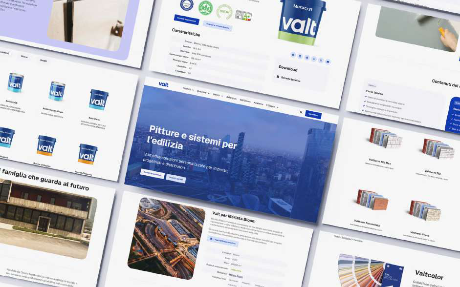
And because the market Valt is moving into rewards it, we built out the sustainability story with substance behind it, alignment to the UN's development goals, environmental product declarations, and Valt Academy, a training track for construction professionals. The point throughout was the same: give the new identity a company worth believing.
What the numbers say
The site went live in July 2024. Across its first year it drew roughly 9.7K active users and 9.7K new users, with an engagement rate of 77 percent, up 21 percent on the prior period. The percentage jumps in traffic are enormous, but they're honest about one thing: before this, Valt barely existed online as a working commercial tool. The real story isn't the growth rate. It's that a fifty-year-old company now has a digital channel its sales network can actually lean on.
The social numbers followed the same pattern through 2025, hundreds of thousands of impressions across LinkedIn, Facebook, and Instagram, off a base that used to be close to nothing. None of it is the finish line. It's the infrastructure a brand needs before a campaign is worth running at all.
Editing, not reinventing
Repositioning a legacy brand looks like a creative act, and part of it is. But the harder discipline is editorial. You're not inventing a company. You're deciding which one word out of a fifty-year-old name is holding the business back, and you're protecting everything else, the roots in the Valtellina, the color expertise, the trade relationships, that a clean-slate rebrand would have thrown out with it.
Valt kept its history and dropped its ceiling. That's what repositioning for what comes next actually looks like.
- A name can quietly become a liability. "Plastic" once described the business exactly; in a market moving toward sustainability, it described the wrong company. The sharpest change was subtractive: one word.
- The boldest brand decisions are claims, not decorations. Taking International Klein Blue lets a color company assert its own expertise without a line of copy.
- An industrial rebrand that stops at the logo fails. The visible identity only holds if governance, product architecture, and digital are rebuilt underneath it.
- Repositioning a legacy brand is editing, not reinventing: protect the fifty years worth keeping, cut the one thing holding the business back.