The making of an identity kit, US Lecce returns to adidas
The three stripes are back on giallorosso shoulders after 34 years. We coordinated the transition from in-house production to a global partner, with one rule: the shirt's meaning doesn't get touched.
4 min read
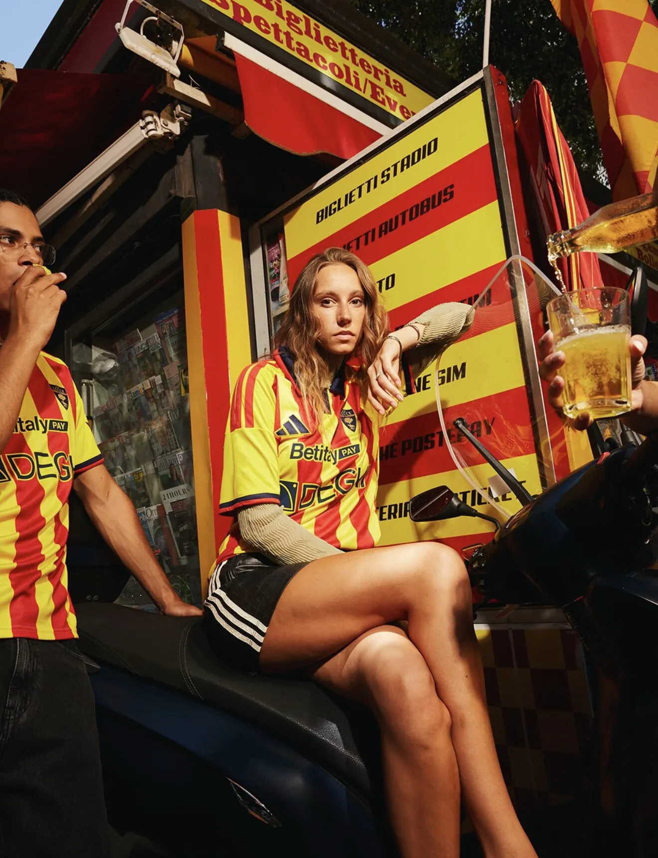
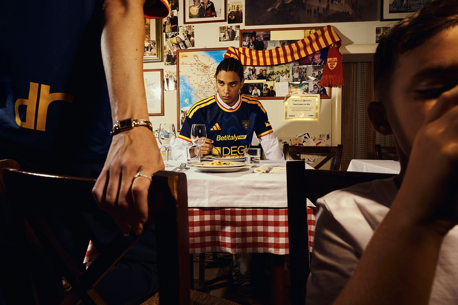
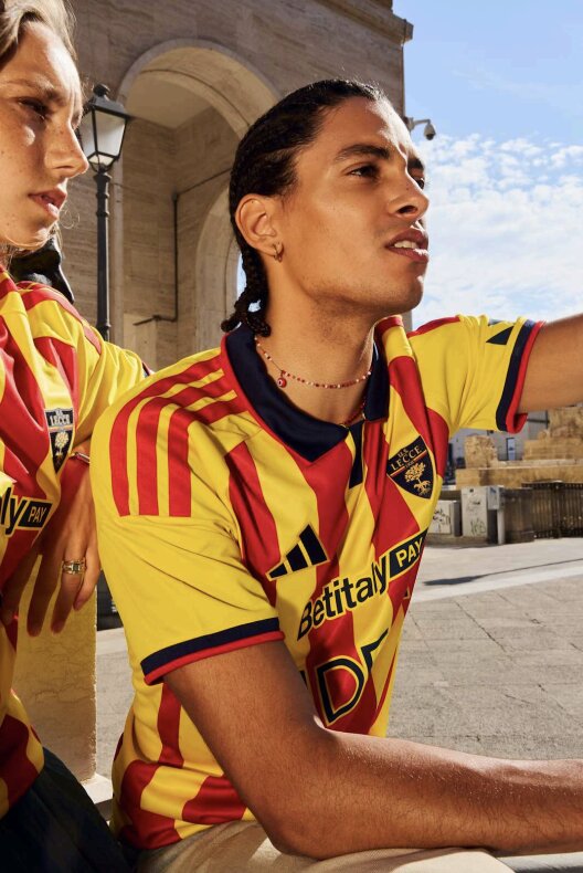
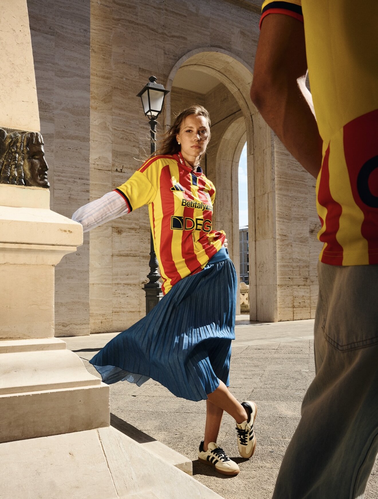
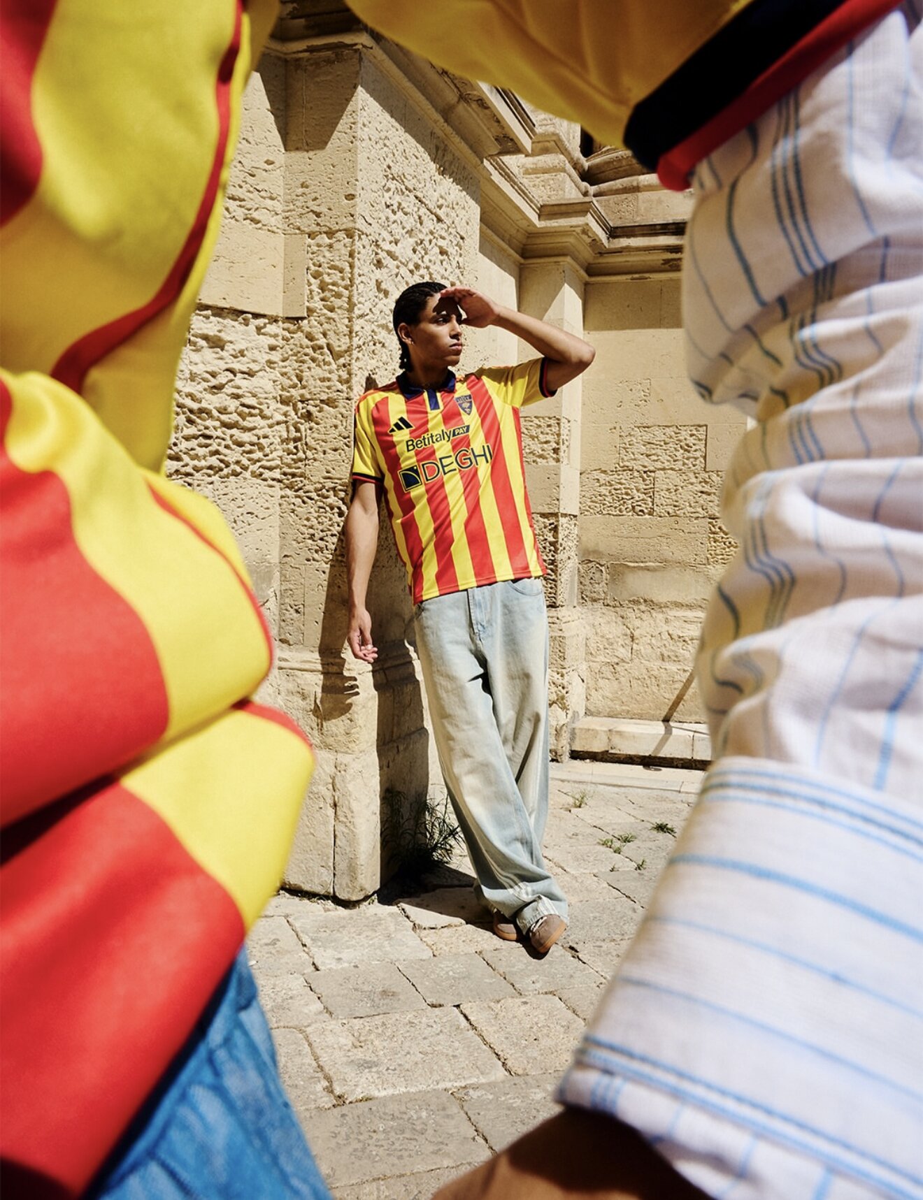
On July 30, 2026, Lecce and adidas presented the home kit for the new season, the first act of a transition we coordinated over the past months: moving the club from eight years of in-house kit production to a multi-year partnership with a global brand. Yellow and red vertical stripes, blue collar, blue shorts and socks, red three stripes on the shoulders. If you saw it without context you might not even notice anything had changed, and that was deliberate. Nobody wanted this shirt to surprise anyone. It had to be recognizable from a hundred meters away.
The kit as a map
It helps to know what the colors are doing. Yellow and red have dressed the club since 1928, and they aren't just the team's colors, they're the city's, the same ones on the civic coat of arms. The crest carries a she-wolf under a holm oak, the leccio the city takes its name from. The blue has been on Lecce shorts since the early decades of the club, and if you ask people in the Salento they'll tell you it's also the blue of the two seas that sit on either side of the peninsula. Whether that last part is design intent or fan mythology doesn't really matter. It's what the shirt means to the people who buy it, and meaning is the whole game here.
So the kit reads like a map. City, sea, team, in that order or any other. You wear the place, not just the club.
From club to destination
Every summer the Salento fills with people. They come for the sea and stay for everything else: the baroque stone of Lecce that turns golden at sunset, the long evenings in the squares, the light that photographers keep trying to explain. And somewhere between a swim and a dinner, many of them end up with a giallorossa shirt in their hands. Some have never watched a Serie A match. It doesn't matter. The shirt is the piece of the Salento you can take home and wear.
Even the stadium says it plainly. Lecce plays at the Via del Mare, the road to the sea, and the name is a manifesto in three words: here, the club and the territory have never been separate things. For the people of the province it has always worked this way. The colors travel with them, to Switzerland, Germany, Australia, wherever Salentini have gone to live over the past half century, and every away game in the north feels like a small family reunion. Now the same colors travel in the suitcases of visitors too, worn in Milan in November by someone remembering an evening in August. A Boca shirt speaks of Buenos Aires before it speaks of a team. Lecce's shirt is learning to do the same for the Salento.
That's what football as destination looks like. The club opens the door to a land, the land fills the shirt with meaning, and the shirt carries both wherever it goes.
From in-house craft to global reach
This is where the real work happened. For eight years Lecce made its own kits under M908, a label named after 1908, the year the club was born. That project earned the club full creative control and shirts that became cult objects. But an in-house brand has a ceiling: distribution, retail presence, international reach. Our job was to manage the passage without losing what those years had built, turning the equity of self-production into negotiating strength with a global partner rather than starting over as a small club asking for a template.
adidas was the natural landing spot, and not only for scale. The last time Lecce wore the three stripes, between 1982 and 1992, the club reached Serie A for the first time and lived the years fans still mythologize. So the return isn't a logo swap. It plugs the shirt back into an emotional archive, and it puts a very local object into global distribution, the one thing self-production, for all its charm, could never do.
The design gets this. Classic stripes, traditional blue, crest where it's always been. When a shirt is carrying this much, you don't redesign it. You get out of its way.
- An identity kit condenses a territory into a garment: city colors, local memory, belonging. That's why it sells to people who never enter the stadium.
- Eight years of in-house production weren't a detour. They built the brand equity that made a global partnership worth negotiating from strength.
- adidas doesn't change what the shirt means. It changes how far that meaning can travel.